This is the last and most advanced part of our manual. We will explain what the primary and secondary colors are, how to measure them, and (on some displays) how to adjust them. We will then propose some directions to change the physical characteristics of some displays, and by adding filters to get a more correct primary color.
Since most monitors do not provide an advanced color management system (CMS) that can properly set the primary and secondary colors, this section should be considered an additional option. Even if your monitor does not provide a CMS, at least you will know more about the color reproduction of your monitor by measuring the primary and secondary colors of your monitor and the grayscale performance.
If you are not sure if your monitor has CMS or other adjustments to the primary or secondary colors, check your manual or ask in our Audio and Video Calibration forum!
What are the primary colors and secondary colors?
Take a look at the CIE diagram in the previous section:
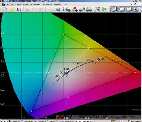
The white points that rely on the D65 center point are the grayscale measurements we made before. What we haven't discussed yet is the black triangle in the picture: it represents the color space (or "gamut") we chose.
This triangle is the range of colors that we expect (or hope) for our display to be reworked. A perfect display will only show colors within the triangle and colors that are not displayed. The standard resolution display SD (Rec601) and the high resolution display HD (Rec709) have different ranges. Because the three points are further apart, HD's Rec709 triangle is larger than Rec601's triangle, so it can display richer colors in HD. This is one of the many benefits of HD over SD. The difference will not be great, but it can be seen. In our picture we use Rec709.
By selecting the "Advanced -> Preferences" menu option, selecting the "References" tab, and changing the "Color Space - Standard" option, you can switch between HD and SD color spaces in ColorHCFR to see the difference. You will see the triangles become larger or smaller as you choose the color space.
Note: The interesting part is how small the SD and HD color spaces are relative to the entire visible color range in the CIE diagram. Remember that the entire CIE diagram shows that we humans can see color. There are millions of visible colors that fall outside the triangle, and HD and Blu-ray discs still can't be displayed, because these colors don't fall within the current standards like Rec601 or Rec709! Maybe one day (probably a near future) The new color space may be formulated into a standard that includes a wider range of colors. Broadcast TV and specific media discs (regardless of what replaces Blu-ray?) may lead to the development of new or expanded color spaces for our home theaters.
What is the primary color point?
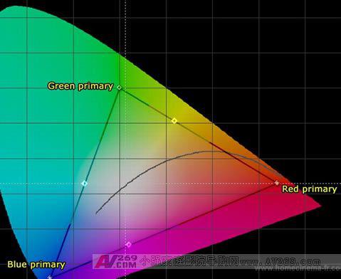
The corners of the triangle in the color space are called 'primary colors' because they represent the three primary colors (solid colors) used to form all the colors in the triangle, red, green, and blue. Your display reproduces every other color in the color space by changing the ratio between red, green, and blue. These three points determine the size and shape of the triangle. If the primary color point of your display does not fall in the correct position, each other color will have some degree of problem (even if your grayscale is perfect).
Forum member Gary Fritz presented a great metaphor to explain this principle:
"Your projector or TV must accurately display the 3 primary colors defined by the standard. If not, your color will be wrong. Why? Imagine your monitor is a blind painter based on digital drawing. He has 3 cans of paint (red) , green, blue), and he only draws signals to tell him the color. If the video signal tells him to draw pure green, he will touch his green paint can and use it. If the signal has a yellow color, he will mix red and green. If someone replaces his green pigment and replaces it with a can of pink paint, now imagine what will happen, he is a blind painter, so he can't correct the wrong color. Obviously his green will be wrong, turf It will turn pink. In addition, all colors that contain green will be wrong. All colors except the pure red, pure blue and pure magenta dark stage with a little green will be wrong."
The primary colors of your display are close to the Rec601 or Rec709 standards. The technology used in your display is highly relevant, how the manufacturer makes them, and what controls are provided to compensate for aging and inconsistencies. A large percentage of digital displays deviate quite a bit, and most CRT displays are quite accurate because CRT is the only technology at the time of standard development (20+ years ago). Because of its color correctness and no color drift (the digital display bulb color output will drift a considerable amount in a short period of time, compared to the CRT image tube color output is still stable), the film studio still uses CRT monitor. There is more information in the first few chapters of the Digital Video Essentials: HD Basics test disc.
To properly set the primary colors, it is necessary to have a separate color management system (CMS) that provides separate controls for each color.
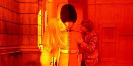
Many of today's new monitors deliberately enhance or offset their colors to display colors outside the range of Rec601 or Rec709. They usually deliberately do this to increase light output (enhance green and blue) and/or cause the colors to look more radiant or pleasing. It's important to remember that this is completely wrong! The end result is a picture that is not what the director wants you to see. This can be illustrated with real-world examples using two different display technologies: our Barco Cine 8 Onyx projector with CRT image tube technology and the high-end JVC RS1 projector with digital D-ILA technology:
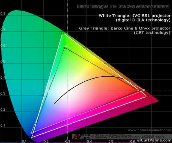
We want both projectors to have the primary colors exactly on the gray triangles that represent our target Rec709 (HD) color space. Barco's primary colors are quite close and do not require additional corrections. The primary colors of JVC deviate quite a bit. They all fall outside the Rec709 (HD) standard and cause the colors to be too rich. In particular, the green primary color is biased to the left, and all greens are yellowish. JVC does not provide a color management system (CMS) that can change the primary colors, so if we want to change the primary colors to a more correct position, an advanced video processor (such as Radiance) or other modifications are needed.
But why is the more intense color not good? You may think that it is good to display colors outside the standard because it can give you a wider range of colors. Unfortunately, this is not true. Even more intense colors look more pleasing in some cases (cartoon or man-made content), but in other we are familiar with 90%+ content, such as human faces or natural scenes we see every day (sky, turf, etc.) Etc), it doesn't look right. Super-saturated colors can cause (as an example) green turf sometimes resembles a fluorescent color. Here is an example:
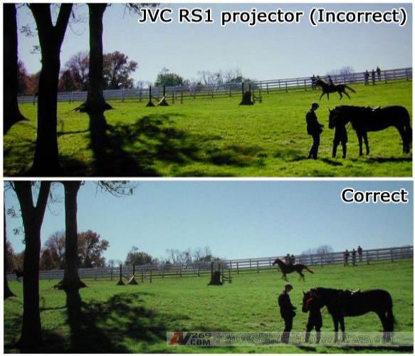
Thanks to Tom Huffman for providing photos
The photo above was taken from the previously mentioned JVC RS1 digital projector, and the photo below is the correct color version. Look at how saturated the color of the JVC RS1 is, not obviously what the director wants to present, and it seems completely unnatural. Your grayscale may be set perfectly, but if the display's color space is too much than the defined SD or HD standard, the turf will look like a fluorescent green grass. This is why many people complain that the newly installed digital display looks like a cartoon or fake feeling. No matter when you want to buy a new monitor, no matter what technology you use, make sure that their primary colors are correct and/or that there is no way to adjust the primary and secondary colors to bring them closer to the correct position. Don't ask how good the primary colors of the monitors in the showroom are, you will get an empty look at you.
What is a secondary color point?
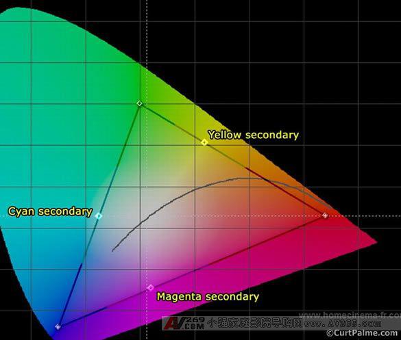
Along the sides of the triangle, we can find the 'sub color'. These secondary color points are obtained from the two primary colors at both ends of the defined mixing line: green and blue turn green, green and red turn yellow, blue and red turn magenta. [page]
The secondary color can be adjusted by adjusting the 'hue' control on your display. The quality of your secondary color measurement is determined by how accurate your primary colors are and whether your monitor's color decoder blends the primary colors in the correct proportions. Again, unfortunately, the hue control of all displays, because it affects 3 sub colors at the same time, is actually quite useless. Adjusting the hue so that one pair of colors is correct usually causes the other two to become more incorrect. To properly set the secondary color, a single color hue control is required. In other cases, we adjusted and tried to average 3 color errors.
Correlation between primary and secondary colors and grayscale? Welcome to China Home Theater Network
As a starting point, the correct grayscale ensures that our monitors correctly display D65 (neutral color) black and white images. Remember that point D65 is where the two white lines in the center of the CIE diagram intersect. The extent to which we can achieve and how to obtain a particular color depends entirely on the correctness of the primary and secondary colors of the display. To make the color on our display 100% correct, 100% correct, three things must be perfect: primary, secondary, and grayscale.
If the grayscale of the display is perfect, but the primary color is too far away, the color will be too thick. If the primary colors are not wide enough, the colors will look too dull. If the primary colors are offset and the triangle appears to be distorted relative to the Rec601/709 standard, the result may be an incorrect hue (especially if the secondary color deviates).
The chart below is a imaginary display with perfect primary and secondary colors. The measured primary and secondary colors are exactly at the point of the Rec709 standard, causing the Rec709 points and triangles to be covered:
If we draw a line from each primary color point through the D65 center point, you will find that the line exactly intersects the secondary color point on the other side of the triangle. This is a perfectly balanced and calibrated display, but with the limitations of display technology and the fact that most display manufacturers are not forced to provide the color management system (CMS) needed to achieve perfection, achieving this goal is very difficult.
In this part of the manual, we measure your primary and secondary colors and see how they relate to perfect (expected) values. ColorHCFR will display a second color space triangle on your CIE diagram, allowing you to see the capabilities of your display relative to the expected Rec601 or Rec709 standards. We will then come up with some tips to improve these results.
As with other items in color correction, remember that everything will affect each other! So have enough background information! Let's start adjusting!
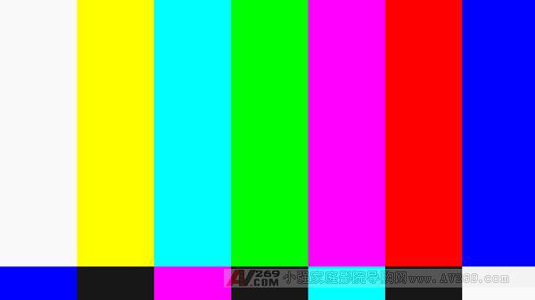
Step 8.1: In this part of the manual, we need to use a different test disc. We don't know at all why Digital Video Essentials: HD Basics test discs do not provide separate primary and secondary color window test patterns. Instead, only SMPTE color bars test patterns that typically contain 6 colors in the same test pattern are provided. The top half of this test pattern looks like this:
Why they contain grayscale window test patterns does not contain individual primary/sub-color window test patterns are not in our discussion.
Background Information: SMPTE stands for Abbreviation for Society of Motion Picture and Television Engineers. The color bars in the SMPTE test pattern are known standards, so comparing the test patterns shown above allows us to know when the video signal is being recorded, transmitted, or displayed (more importantly, what is needed to apply those compensation to the signal) The change can be made to return it to its original state. It usually plays for hours after the TV ends, but on the 24 hours a day, you rarely see it on TV.
The SMPTE color bars test pattern can't be used in some of the sections of our manual, but the rest is fine. Ideally we need an individual window test pattern like our previous gray window test pattern, but this time it was changed to use primary and secondary colors instead. The test disc we are going to use is the AVS HD 709. It is free and can be downloaded in AVS HD 709: it contains all 10% window test patterns of primary and secondary colors, we can set our chroma and hue appropriately, as well as other additional color management systems (CMS). .
A little shortcoming is that the AVS HD 709 only has Blu-ray and HD DVD discs, and you must download and burn the test disc yourself. The test disc can be burned to a normal blank and then played on an HD DVD or Blu-ray player (depending on the version you downloaded). It may sound strange that you don't need an HD DVD or Blu-ray burner to make HD DVD or Blu-ray discs: instead, we use HD DVD or Blu-ray content on a standard DVD disc. HD DVD or Blu-ray player is a must, but can be burned on any DVD burner. As for the latest version of this test disc, Chapters 1-7 contain the window test pattern of the 100% saturated color of the primary and secondary colors we want to measure. Welcome to China Home Theater Network
Note: The AVS HD 709 test disc actually contains the test pattern that will be used throughout this manual. As for why we didn't use this test disc before, it's because not everyone is used to burning their own discs or having HD DVD or Blu-ray players. At the same time, AVS HD 709 still has modifications in progress, representing the test pattern is considered to be still in the process of improvement, which will cause us to rewrite the manual with it. This is the test CD we found to be inexpensive, the most complete, and already available!
If you have a different test disc, a 100% saturated 100 IRE window test pattern with primary and secondary colors is also available. GetGrey is a common (non-free) test disc that is also available. ColorHCFR designers have also mentioned their own PAL format test discs. The Avia test disc contains individual test patterns for primary and secondary colors, but they replace the window test pattern with full screen, which causes problems in plasma and CRT displays.
Some calibration discs will tell you to use tinted transparencies to adjust hue and chroma, and don't do this. This method can't be used on all monitors and is just an approximation. It's best to use your sensor.
Before proceeding to the next step, it is important to confirm that you have completed all the steps described above in the manual, including setting contrast control, brightness control, and grayscale to the best possible state.
Now go to the adjustment! [page]
Step 8.2: Adjust chroma control
Chroma control is a traditional control from the age of 480i composite video (do not confuse with color difference). It also adjusts the intensity of the three primary colors or 'brightness'. Since it affects the three primary colors at the same time, it is very useless for precise correction. We will adjust it to make sure it is as close as possible to the correct value.
Since chroma control affects the intensity of the three primary colors, we choose one (in our case is red) to adjust and hope that others will follow. To properly set the three primary colors requires a comprehensive color management system (CMS). If your monitor has a comprehensive CMS, we will adjust it in the next steps.
Some monitors' chroma control will have no effect on other inputs except for low-order 480i composite or S-video inputs. If you use RGB, color difference, DVI, or HDMI input on your monitor, and find that your monitor's chroma control has no effect or can't be adjusted, skip this step and you don't need to do anything.
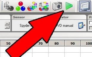
In ColorHCFR, press the green triangle symbol to initiate a continuous measurement of the xyY reading:
To find out your AVS HD 709 test disc, select "10% Grayscale" -> "100% Gray Window" and jump to the 100% all white window test pattern. 100% means that the window pattern is at 100 IRE intensity. Write down the sensor's Y (illuminance or brightness) reading:
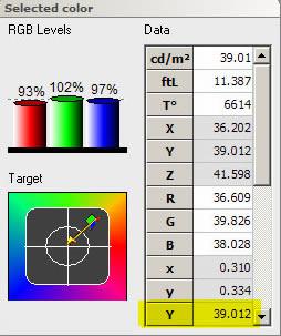
Select "100% Saturated Colors" -> "100% Red Window" and jump to the red window test pattern.
Adjust the chroma control on your display until the Y reading is 21% of the previously read Y% of the 100% all white window pattern. For example, if the previous Y value is 39.012 as shown above, then 21% is 39.012 x 0.21 = 8.193.
That's right! This will set the red chroma appropriately. I hope the green and blue strength will be correct together.
Note that adjusting the chroma control does not change the color x/y coordinates of the primary colors, it only affects the intensity or illumination of these colors. To adjust the x/y coordinates of the primary colors, changes in physical properties or an advanced color management system (CMS) is needed – talk later!
Step 8.3: Adjust phase control
Phase control is a traditional control from the age of 480i composite video (do not confuse with color difference). Phase control is used to fix the hue errors of the three sub colors. Since it affects three pairs of colors at the same time, it is very useless for precise correction. We will adjust it to make sure it is as close as possible to the correct value.
Since the phase control affects the three colors, we choose one (in our case is green) to adjust and hope that others will follow. To properly set up three colors requires a comprehensive color management system (CMS). If your monitor has a comprehensive CMS, we will adjust it in the next steps.
Some monitors' phase control will have no effect on other inputs except for low-order 480i composite or S-video inputs. If you use RGB, color difference, DVI, or HDMI input on your monitor, and find that your monitor's chroma control has no effect or can't be adjusted, skip this step and you don't need to do anything.
Set the phase control of your display to the middle position (preset).
Make sure ColorHCFR is still in continuous read mode. If not, press the green arrow graphic again.
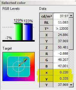
To find out your AVS HD 709 test disc, select "100% Saturated Colors" -> "100% Cyan Window" and jump to the 100% cyan window test pattern.
We'll try to make the x/y reading as close as possible to the cyan you used in the color space selected in this manual. If you have forgotten, click on the "Advanced -> Preferences" menu option and press the "References" tab to find it.
The PAL/SECAM cyan target value is x=0.220 / y=0.329
SD TV - REC 601 (NTSC) The cyan target value is x=0.231 / y=0.326
HD TV - REC 709 cyan target value is x=0.225 / y=0.329
Adjust your phase control until you get as close as possible to the x/y value of the target:
That's right!
Note that the cyan points in three different color spaces are very close. The DeltaE between any two is less than 5. Any point close to it can be considered quite correct cyan. If you have to adjust the phase control quite far from the middle position to get the reading value close to correct, it is very likely that the other two sub colors (magenta and yellow) will deviate. The target values ​​for magenta and yellow are: Welcome to China Home Theater Network
The PAL/SECAM magenta target value is x=0.327 / y=0.157, and the yellow target value is x=0.417 / y=0.502
SD TV - REC 601 (NTSC) magenta target value is x=0.314 / y=0.154, yellow target value is x=0.421 / y=0.507
HD TV - REC 709 magenta target value is x=0.321 / y=0.154, yellow target value is x=0.419 / y=0.504
Again, all three sets of points are quite close to the other groups. In the next step, we will measure all three primary colors and secondary color points to see if the results are balanced. We want the error of the three sub-colors (DeltaE) to be roughly the same. If the magenta or yellow DeltaE is much larger than the cyan, you may have to go back and adjust your cyan. It is best to have the three secondary colors deviate by about the same amount, rather than having a perfect secondary color but at the expense of the correctness of the other two secondary colors.
OK! So now the chroma control and phase control have been set up properly, let's measure our primary and secondary colors, and first look at their relationship to known standards.
Step 8.4: Measure the primary and secondary colors <br> Measuring the primary and secondary colors is actually very simple. We display both primary and secondary colors and measure with ColorHCFR. Press the "Measure primary and secondary colors" button:
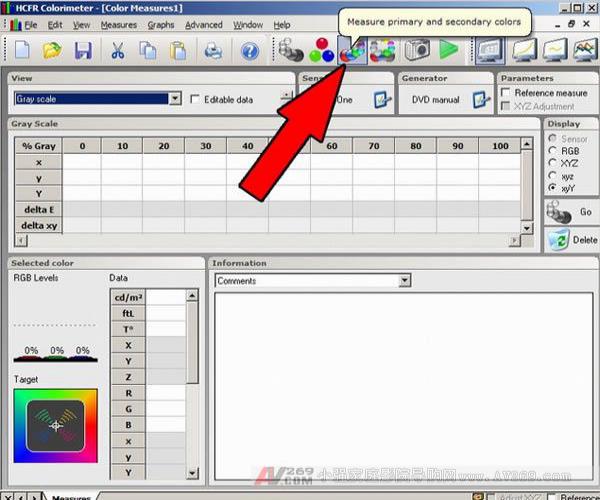
ColorHCFR will ask you to display the primary and secondary colors (100% saturation), one after the other, in each color pause for the sensor to read the value. The 100% saturation refers to the brightness of the color is 100 IRE or fully open.
Testing the disc with the AVS HD 709 is currently the best option, but if you only need to measure your primary and secondary colors without making the aforementioned adjustments, you can use the Digital Video Essentials: HD Basics to test the SMPTE test pattern of the disc. You can use the "SMPTE 75% Color Bars w/ Gray Scale" test pattern on the Digital Video Essentials: HD Basics test disc with all colors. Select the disc's menu option "Complete Program Menu" -> "Advanced Video Test Patterns" -> 1080p or 720p -> "SMPTE 75% Color Bars w/ Gray Scale". You must then move the sensor to the location where ColorHCFR requires the correct color. The pain of the projector user is that if you want to re-measure your grayscale, you need to re-adjust the position of the sensor again as you did in the previous steps. Even if the color in the test pattern is replaced by 75% saturation with 100%, this test pattern is not recommended for use in CRT or plasma displays because the brightness may be different from the smaller window test pattern. The 3-CRT CRT front projection and rear projection display may be affected by color shift errors because the color falls to the left or right of the image. [page]
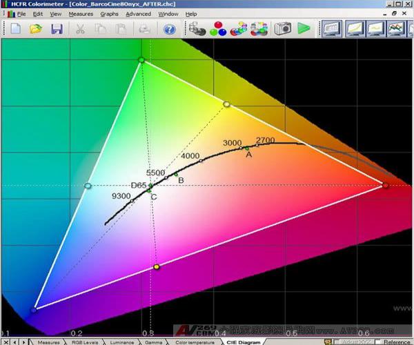
Once completed, you will have the entire set of primary and secondary colors as shown below:
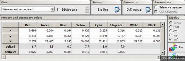
Similar to the gray scale measurement, we hope that the DeltaE of all six primary and secondary color measurements is less than or equal to 10, and better to 3. With our Barco Cine 8 Onyx projector, you can see that our results are all at 10, so we are very happy!
If we look at the CIE diagram, we can see the graphical relationship between these points and the Rec709 color space standard we chose earlier:
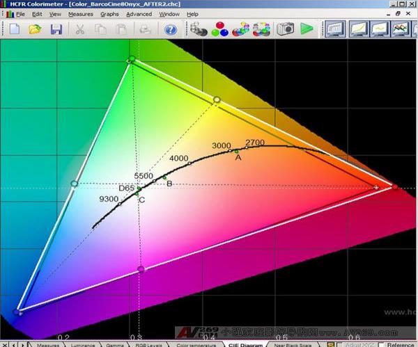
What's interesting is that our red color looks quite far from the standard compared to green or blue, but our DeltaE values ​​for all three colors are quite close. Pay more attention to the value of DeltaE instead of the CIE diagram until you are used to the relationship between the reading value and the CIE diagram.
In our Barco projector, it is almost impossible to adjust the primary or secondary colors. It does not have an advanced color management system, and there is no chroma control and phase control for high resolution signals (above 480i) via RGBHV input.
What is your secondary color value? Is the blue DeltaE much smaller than the magenta and yellow DeltaE? If so, we recommend jumping back to step 8.3 and adjusting your phase control to try to average the error between the three secondary colors.
Step 8.5: Advanced Color Management System (CMS) Adjustments <br> Some advanced displays have advanced CMS that can be used to directly adjust all six primary/sub colors. Most monitors (including all CRT projectors) do not have these adjustments. If you are in this category, skip this step. Welcome to China Home Theater Network
CMS controls do not have a standard name. Usually the control includes saturation control (chroma control), phase control, hue control, and brightness control (or brightness value). In the next steps we are going to adjust the brightness control, hue control, and saturation control. If your monitor does not have an advanced CMS you need to refer to your user manual to find the name used for your monitor.
Keep in mind that CMS adjustments are only for advanced users. You may find this to be the most complicated and confusing part of the manual, so don't double it up. If it requires you to do some experimentation to understand how these controls work. When in doubt, return to the default or ask someone else who uses the same monitor for assistance. The internet is a great source for assistance.
In step 8.2 we adjusted the intensity of the red. If your monitor is advanced CMS, we can now do the same for green and blue as follows:
Confirm that ColorHCFR is still in continuous capture mode. If not, press the green triangle again. To find out your AVS HD 709 test disc, select "100% Grayscale" -> "100% Gray Window" to jump to the 100% all white window test pattern. Make a note of the sensor's Y (illuminance or brightness) reading. Select "100% Saturated Colors" -> "100% Green Window" and jump to the 100% green window test pattern. Adjust the green 'brightness' control of the CMS in your display until the Y reading is 71% of the previously measured 100% all white window reading. For example, if the previous Y value is 39.012 as seen above, then 71% is 39.012 x 0.71 = 27.699. Select "100% Saturated Colors" -> "100% Blue Window" and jump to the 100% blue window test pattern. Adjust the blue 'brightness' control of the CMS in your display until the Y reading is 8% of the previously measured 100% all white window reading. If the previous Y value is 39.012 as seen above, then 71% is 39.012 x 0.08 = 3.121. This is the first step. This step correctly sets the green and blue color decoding adjustments. We have previously adjusted the red part with a comprehensive 'chroma' control.
The next part is to adjust the 'hue' and 'saturation' controls in the CMS to adjust all six primary and secondary colors. This is to make our primary and secondary colors as close to perfect as possible. Depending on the color space you are using, the x/y/Y of the 6 reference points are as follows:
PAL/SECAM:
Red primary color: x=0.640 / y=0.330
Green primary color: x=0.290 / y=0.600
Blue primary color: x=0.150 / y=0.060
Yellow secondary color: x=0.417 / y=0.502
Cyan secondary color: x=0.220 / y=0.329
Magenta secondary color: x=0.327 / y=0.157
SD - REC 601 (NTSC):
Red primary color: x=0.630 / y=0.340
Green primary color: x=0.310 / y=0.595
Blue primary color: x=0.155 / y=0.070
Yellow secondary color: x=0.421 / y=0.507
Cyan secondary color: x=0.231 / y=0.326
Magenta secondary color: x=0.314 / y=0.161
HD - REC 709:
Red primary color: x=0.640 / y=0.330
Green primary color: x=0.300 / y=0.600
Blue primary color: x=0.150 / y=0.060
Yellow secondary color: x=0.419 / y=0.505
Cyan secondary color: x=0.225 / y=0.329
Magenta secondary color: x=0.321 / y=0.154
Refer to the x/y value of the color space you selected, follow these steps:
Select "100% Saturated Colors" -> "100% Red Window" to jump to the 100% red window test pattern. Adjust the red 'hue' and 'saturation' controls of the CMS in your display until the x/y value is as close as possible to the above reference. Repeat these two steps to complete all other primary and secondary color adjustments in the order of green, blue, yellow, cyan, and magenta. When making these adjustments that affect x/y, pay attention to the Y (illuminance) value. Only the x/y value will be changed. However, the color management system of some monitors is not well designed and will affect the Y value. You may end up with a correct x/y value and the correct CIE diagram, but the light output may be completely incorrect, causing it worse than you started! If the Y value starts to change dramatically, return to the Y value. position. That's right! Your primary and secondary colors should be as close as possible to the reference. We recommend re-measuring the primary and secondary color points (as in step 8.4) to see how close your readings are.
Because all of these controls affect the controls we have previously adjusted, we recommend that you quickly re-execute the entire manual once and re-measure the contrast, brightness, grayscale, and more until you perform all the steps in this manual. You don't need to make any adjustments, you should always go back and re-measure all items. When done each time, the adjustment should be smaller until no adjustments are needed at the end.
Step 8.6: Achieve a more correct primary color extra direction and è¯€çª <br> Here are some additional tips and tricks that allow you to essentially change your display to get a more correct primary and secondary color.
CRT projector :
It is possible to adjust the primary color of the CRT projector on some models by replacing the lens or dyeing the CRT coolant. You can do this with a colored lens or coolant. Getting the CRT projector's primary colors close to the target value is why some manufacturers use the only purpose of dyeing. The main consideration for manufacturers who do not do this is the amount of light output, because these modifications result in a more accurate primary color at the expense of lowering the light output. Welcome to China Home Theater Network
How do you separate the CRT projector from a dyed lens or coolant? When you are using your CRT projector, look at the red and green lenses with a flashlight. The surface of the CRT tube is white or red and green. If they are white, then you are not dyed, and your primary colors may be deviated, causing your green to yellow and red to orange.
By dyeing, we filter out unwanted colors, leaving only pure red and green. The blue image tube is never dyed because it is very close to the correct value, and the Blu-ray output is extra. The red and green lenses dyed by our Barco projectors are the main reason why its primary color readings are near perfect. [page]
So what if your red and green are not dyed?
For low-end air-coupled CRT projectors, you have three options:
If your lens is a commonly used HD8 lens for Barco, Electrohome, Sony, and Ampro models, you can use the Joustmods.com HD144/145 lens adapter kit to convert them to a dyed HD144 (or HD145) lens. The key is to find a second-hand HD144/145 lens. They are used on NEC PG and XG CRT projectors. These lenses are often difficult to separate, so buying a zero-removed NEC CRT projector is one of them. Ebay or our own Buy and Sell forum is another way. Another benefit is that the HD144/145 lens is sharper (especially corners) than the HD8 lens. Changing the lens is a quick and easy job for anyone, and it should take up to an hour. If your lens is not HD8, you can use a dyed coolant to replace the clear coolant in front of the tube. Unfortunately, it is difficult to buy dyed coolant on the market, because I have never seen the original factory sold separately. We have not heard of anyone who has the ability to get dyed coolant. Amateur players figure out how to dye the clear coolant on their own. You can find the steps in our Tinting Glycol manual. Dyeing your coolant will take a lot more work than changing the lens, because the projector may need to be lowered and the image tube needs to be removed and disassembled. This is a complicated procedure for most people. The following methods are not recommended as a long-term solution. You may use Rosco Calcolor filters to make cheap modifications to see the performance of the correct primary colors. These filters can be purchased on Ebay for less than $10. You need 4690 (dark red) and 4460 (medium green), and you may want to experiment with 4430 (light green) or 4660 (medium red). Cut a piece of filter that fits your CRT tube. Remove the red and green lens, clean the glass on the front of the CRT with a good glass cleaner and fiber-free cloth, spray a little detergent on the filter, attach it to the CRT glass and discharge any air bubbles. (When you do this, you may need to cover it with a piece of tissue so you don't leave fingerprints on it.) Surface tension will allow the filter to stick to it for a long time. Reinstall your lens and recalibrate your grayscale. Once again, we don't recommend this as a long-term solution, because the color will be much better, but the image will be a bit soft and there may be a feeling of fogging. These filters are used in stage lighting and are not optical grade. For higher-order liquid-coupled CRT projectors, your only method is to replace your transparent red and green c-elements with dyed c-elements. This step can be seen in (Barco) and this (Electrohome). Replacing c-elements requires a lot of work, because the projector must be lowered and the image tube must be removed to perform these actions safely.
After completing these procedures, you can get a more accurate primary color, and it is worth doing, as you can see in the photo:
Thanks to forum member Chris Johnson for providing photos.
On the left side of the photo is the original red image tube with no color filtering, showing a bit of red/orange. After filtering on the right, no orange hue is shown.
Below is a CIE diagram showing the comparison of measurements before and after the Electrohome 8500 air-coupled CRT projector:
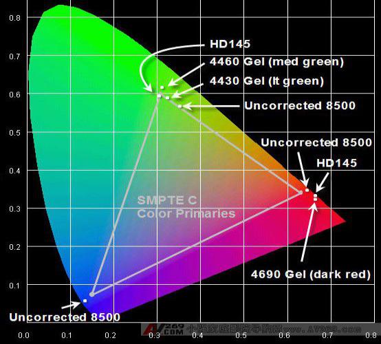
Thanks to Forum member Gary Fritz for providing photos and information.
The original 8500 did not do any filtering in red and green. Because the blue color is quite close to the correct color, it is only slightly more beautiful than correct, and does not require any filtering. This (and the limited blue light output) is why blue does not require color filtering. There are quite a lot of green deviations and there is too much "yellow" feeling. The first Rosco (4430) filter brings it closer to the correct value, and the second (4460) brings it closer. The HD 145 lens makes it fit perfectly to the correct value, which is the value we want. Surprisingly, the uncorrected red measurement is correct, but it has a slight bias towards the 'orange/red' area. HD145 and red film move it to a more "strong red" zone, but maintain the correct red hue.
In addition to the methods listed above, there are other methods, such as the use of an external video processor such as Radiance is the only other method. CRT projectors do not have enough advanced color management systems (CMS) to change the primary colors. It is important to remember that external processing does not increase the color space of the projector, it only reduces it. More expensive video processors (such as Radiance) can also let you change the secondary color.
Digital projector:
If your digital projector's blue and green primary colors deviate too much and the color is too bright, you may be able to add a filter in front of your lens. The CC20R, CC30R, and CC40R filters (for example) are general choices. These optical filters can be added to the light path in front of your digital projector. It limits the light output of a particular color (mostly blue/green), which reduces the black level and also corrects the blue and green primary colors (red is not affected). The numbers above represent the percentage of attenuation. For example, the CC20R filter attenuates 20% of the light output.
These filters are effective at very dark image levels, so if you find that the dark portion of the image is too blue-green (probably because of an unfiltered bulb), consider using a color correction filter in front of the projector lens. They can be purchased from photographic equipment such as B and H Photo Video. They provide excellent color balance when the projector output is at very dark image levels. You need to figure out how to fix these filters in front of the projector lens.
既然滤镜会在低光区会å‡å°‘ç¯æ³¡çš„输出,色彩矫æ£æ»¤é•œç»™ä½ 更深沈的黑色以åŠå¢žè¿›æ ¡æ£åŽçš„对比值。一些é¢å¤–的资讯å¯ä»¥ä»Žè®ºå›æˆå‘˜ChrisWiggles ( Source Settings Guide 的作者):
引述:
滤镜本身是被动的,并ä¸ä¼šå½±å“对比值。在数ä½æ˜¾ç¤ºå™¨ä½¿ç”¨è‰²å½©æ»¤é•œçš„åŽŸå› æ˜¯æ•°ä½æ˜¾ç¤ºå™¨é€šå¸¸ä¼šæœ‰å¤ªå¤šçš„è“或绿,但用数ä½æŠ•å½±æœºçš„调整去é™ä½Žè“/绿的输出会é™ä½Žå¯¹æ¯”å€¼ï¼Œå› ä¸ºä½ é™åˆ¶äº†å„个原色的on/off å¯¹æ¯”ã€‚å½“ä½ é™ä½Žå„ä¸ªåŽŸè‰²æŽ§åˆ¶çš„å¢žç›Šï¼Œä½ ä¹Ÿå¿…é¡»é™ä½Žæ•´ä½“的白色ä½å‡†ä»¥ç»´æŒä½ŽäºŽæ˜¾ç¤ºå™¨çš„白ä½å‡†é¥±åˆç‚¹ï¼Œå¦‚åŒåŽŸè‰²çš„å¢žç›Šè¢«è°ƒä½Žã€‚è¿™æ ·ç‰ºç‰²äº†å¯¹æ¯”å€¼ã€‚ç”¨è‰²å½©æ»¤é•œå¯ä»¥è¾¾åˆ°ç›¸åŒçš„目的而完全ä¸å¿…牺牲对比值(或儘少)ï¼Œå› ä¸ºä½ å¯èƒ½å®Œå…¨ä¸éœ€è¦è°ƒä½ŽåŽŸè‰²çš„增益(或儘少)而获得适当的ç°é˜¶ã€‚用这个方法,色彩滤镜最åŽå¯ä»¥å¢žåŠ ä½ çš„æ ¡æ£åŽçš„å¯¹æ¯”å€¼ï¼Œä½†ï¼Œé™¤äº†å®ƒåœ¨æ ¡æ£ç¨‹åºä¸Šæœ‰å¸®åŠ©å¤–,它本质上完全ä¸ä¼šå½±å“对比值。 Welcome to China Home Theater Network
è¦ä½¿ç”¨é‚£ç§æ»¤é•œåŠå¦‚何安装åŠæ ¡æ£è§†æ‰€è¦å¤„ç†çš„投影机,并且超过这本手册的范围。确定的是当滤镜安装完æˆåŽï¼Œä½ 还是需è¦å†å†æ ¡æ£ä½ çš„ç°é˜¶ã€‚
å¦ä¸€ä¸ªæ–¹æ³•æ˜¯ç”¨å¦‚Radiance高阶视讯处ç†å™¨ï¼Œç›´æŽ¥ä¿®æ”¹åŽŸè‰²åŠå‰¯è‰²å€¼ã€‚然而外部处ç†æ˜¯ä¸èƒ½å¢žåŠ 投影机色彩空间,它åªä¼šå‡å°å®ƒã€‚å¦‚æžœä½ å¯ä»¥ä¸éœ€è¦å‰¯è‰²è°ƒæ•´çš„è¯ï¼Œé‚£ä¹ˆè¾ƒä¾¿å®œçš„Lumagen VisionHDP 或VisionHDQ是å¯ä»¥è€ƒè™‘的选项。
直视型显示器:
直视显示器没办法改å˜ï¼Œå› 为没有镜头或是在显示器表é¢ä¸Žè§‚èµè€…ä¹‹é—´çš„æ»¤ç½‘ï¼Œæ‰€ä»¥æ²¡åŠžæ³•è°ƒæ•´ä»»ä½•ä¸œè¥¿ã€‚é™¤äº†è¯·ä½ çš„å®¢äººéƒ½æˆ´ä¸Šç”¨å‰è¿°æ»¤é•œé•œç‰‡åšçš„太阳眼镜,唯一的方法是用高阶å€é¢‘器或是如Radiance高阶视讯处ç†å™¨ï¼Œç›´æŽ¥ä¿®æ”¹åŽŸè‰²åŠå‰¯è‰²å€¼ã€‚然而外部处ç†æ˜¯ä¸èƒ½å¢žåŠ 投影机色彩空间,它åªä¼šå‡å°å®ƒã€‚
Conclusion
æˆ‘å¸Œæœ›è¿™æœ¬æ‰‹å†Œå¸®åŠ©ä½ äº†è§£é€‚å½“çš„ç°é˜¶åŠè‰²å½©æ ¡æ£æ˜¯å½±ç‰‡å†çŽ°æœ€é‡è¦çš„环节之一。导演ã€æ‘„影师ã€åŠå½±ç‰‡è‰²å½©æ€»ç›‘ç»è¿‡å¾ˆå¤§çš„努力确ä¿ä½ 在DVDã€è“å…‰ã€æˆ–HD DVD上看到的电影是用æ£ç¡®çš„色彩演译。ç»ç”±å®Œæˆä½ 的份内的工作åŠæ ¡æ£ä½ çš„ç°é˜¶åŠè‰²å½©ï¼Œä½ å¯ä»¥ç¡®è®¤ä½ 在家看到的东西是跟这些专业人员想è¦å‘ˆçŽ°ç»™ä½ 的完美契åˆã€‚
è¿™æœ¬æ‰‹å†Œæ˜¯å› ä¸ºè®¸å¤šæˆ‘ä»¬çš„newsletter 读者多年æ¥è¯¢é—®æœ‰å…³ç°é˜¶åŠè‰²å½©æ ¡æ£ä¸‹è€Œäº§ç”Ÿçš„。藉由低于US$150å¯é 的感测器åŠåƒæ˜¯ColorHCFR的优异å…è´¹è½¯ä½“ï¼Œå®ƒæ— ç–‘æ˜¯æ‰€æœ‰å®¶åºå‰§é™¢çŽ©å®¶è¯¥åœ¨ä»–们的工具箱è£å‡†å¤‡æŸç§æ„Ÿæµ‹å™¨ã€‚
æˆ‘å¸Œæœ›ä½ è§‰å¾—è¿™æœ¬æ‰‹å†Œæœ‰ç”¨!
éžå¸¸æ¬¢è¿Žä»»ä½•è¯„论与回馈。我们会é”ä½è¿™ä¸ªè®¨è®ºä¸²ä»¥ä¿æŒç‰ˆé¢æ¸…æ™°ï¼Œä½†ä½ å¯ä»¥å°†ä½ 的问题或评论贴在我们的官方'Greyscale & Colour Calibration for Dummies' Q/A thread或在我们的Audio and Video Calibration forum 开啟一个新的讨论串。
æå–œ!æˆ‘å¸Œæœ›ä½ äº«å—ä½ å·¨å¹…æ”¹è¿›åŽçš„家åºå‰§é™¢!
Kal
Editor/Webmaster: curtpalme.com
China leading manufacturers and suppliers of Brushless Dc Servo Motor,Brushless Dc Servo Motors, and we are specialize in Dc Servo Motor In Robotics,Servomotor For Vehicle Robot, etc.
Motor Voltage: 12V 24V 48V
Motor Power: 100w 200w 400w 500w 750w 800w 1000w 1200w 1500w 2000w 3000w
Motor speed: 1500rpm 3000rpm
Encoder: 2500ppr, optical, if you need other type encoder, please advise.
The motor also be named pmsm motor, permanent-magnet synchronous motor, sinusoid wave, be widely used in robot vehicle.
Brushless Dc Servo Motor
Brushless Dc Servo Motor,Brushless Dc Servo Motors,Dc Servo Motor In Robotics,Servomotor For Vehicle Robot
Jinan Keya Electron Science And Technology Co., Ltd. , https://www.keyaservo.com